Not the right mood for a great presentation.
Image by Usman Yousaf on Unsplash
Learn from my mistake. Don’t commit harakiri by Keynote.
You might well have watched ”Death by PowerPoint, the TEDX talk by JD Phillips, on how to avoid boring your audience to death with uninspiring presentations presentations.
This post is different. It’s not for your audience. It’s for you, the presenter. It’s about how to avoid committing harakiri in public in your next online meeting, be it Zoom or MS Teams.
Or, in other words, it’s about avoiding making the same mistake I did in the spring of 2020.
Checking three simple settings in Keynote will save you from public humiliation.
An hour I will always remember, but want to forget
Spring 2020. Loads of people get sent home from their offices, most of them utterly unprepared. Well, I thought, I have worked remotely for over a decade and trained innumerable users in the why’s and how’s of remote collaboration. I have knowledge and experience that others desperately need. So I started doing webinars and sharing tips and tricks. Then came the day when I was due to deliver my first webinar for UP, where I had recently become a member.
UP is the World’s first cloud agency and has worked remotely from the start ten years ago. UP being in advertising, the presentation template was in Apple Keynote of course. So I transferred my slides to Keynote from PowerPoint which I had used before.
As soon as I went into slideshow mode, my nightmare began. When I needed to shift back to Zoom (as you do a lot when presenting online), I couldn’t use Command + Tab to shift between running applications. Then, I suddenly realised that my mouse pointer didn’t show either. It was like navigating blindfolded! I’m rarely struck with tech panic, but this pushed me over the edge and my presentation turned into my worst performance ever. I write this to save you from the same embarrassment.
Blame the sleek style perfectionists at Apple
Apple design is all about less is more. Sleek is just the first name. So, when the designers at Apple made a presentation software years ago, they obviously had in mind that presenting should be sleek and minimalistic. But they designed for presenting on stage, with a beamer. Not for presenting online where you constantly need to shift between your slides and the meeting service. To keep an eye on audience feedback, comments, the chat or shift between showing slides and presenting with you in focus, or participants.
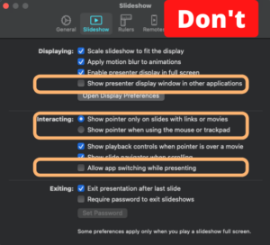
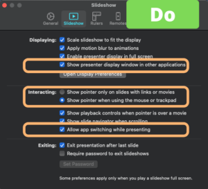
So, they created settings to minimise disturbances on screen. Like ”Show the mouse pointer only on slides with links” and set it ON as default. So, Unless you have a link on your slide, you hav no chance of seeing where your mouse is! Navigating blindfolded in other words.
The next setting was probably intended to avoid mistakenly shift tasks while presenting. They disabled task shifting using the short keys ”Command + Tab” (on Mac) or ”Alt + Tab” (in Windows). That completed my harakiri. Not only could I not see my where my mouse was on the screen. I couldn’t shift back and forth between my presentation and Zoom (or any other meeting software for that sake).
Check your settings, or be doomed
So, before you use Keynote in Slideshow mode for an online presentation, go to the Settings, select Slideshow and make sure to have them as in the second image. NOT as in the first.

Avoid these three settings for any online presentations.

Make sure to have these three settings like this.

Lämna en kommentar
Want to join the discussion?Dela med dig av dina synpunkter!